
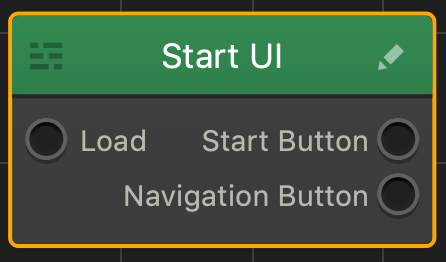
Navigation Button
Depending on the function you select for the button, add this button to create a Pause, Back, Restart, Reset Settings, or any other button on the screen. Just drag it from the Asset panel to the UI Editor and define the navigation button  attributes as described below.
After you drag the button from the Asset panel to the Editor, an additional output appears in the corresponding UI node on the Mind Map. After you rename the button and customize its options, the name of this output will be updated accordingly.
NOTE: You can also add a Navigation button using the Buildbox menu. Go to Add > New Button and select an image you want to be used as a Navigation button.
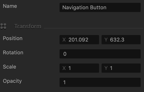
Name and Transform Attributes
| Option | Description |
| Name | Enter a custom name for the button, if needed. It will be displayed in the Outliner.
TIP: Don’t leave this field blank, as you won’t be able to tell what button it is if you hide it. |
| Position | Enter the appropriate values for each axis to specify a precise position for the button on the screen.
TIP: You can also drag the button to the desired location directly in the UI Editor. |
| Rotation | Enter a degree value to specify the rotation angle of the button. |
| Scale | Enter a value for each axis to make the button as proportionally large, or wide or narrow as needed.
TIP: You can also select the button in the UI Editor and drag its corner handles to resize it as needed. |
| Opacity | Enter a value from 0 to 1 to specify the transparency of the button. For example, if you enter .5, the image will be semi-transparent. |
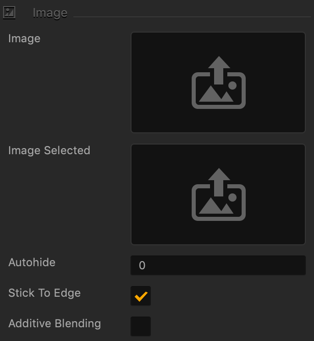
Button Image Attributes
| Option | Description |
| Image | Drag a PNG image for the button in its inactive state. |
| Image Selected | Drag a PNG image for the button when it is selected. |
| Autohide | If you want the button to appear momentarily and then fade away, specify the number of seconds for the button to be displayed for before disappearing.
To keep the button displayed on the screen, enter 0. |
| Stick to Edge | Select this checkbox to keep the relative size and position of the button when scaling the screen for different sizes. |
| Additive Blending | Select to add a glow effect overlay to any graphics or 3D objects underneath the button. |
Sound and Other Properties
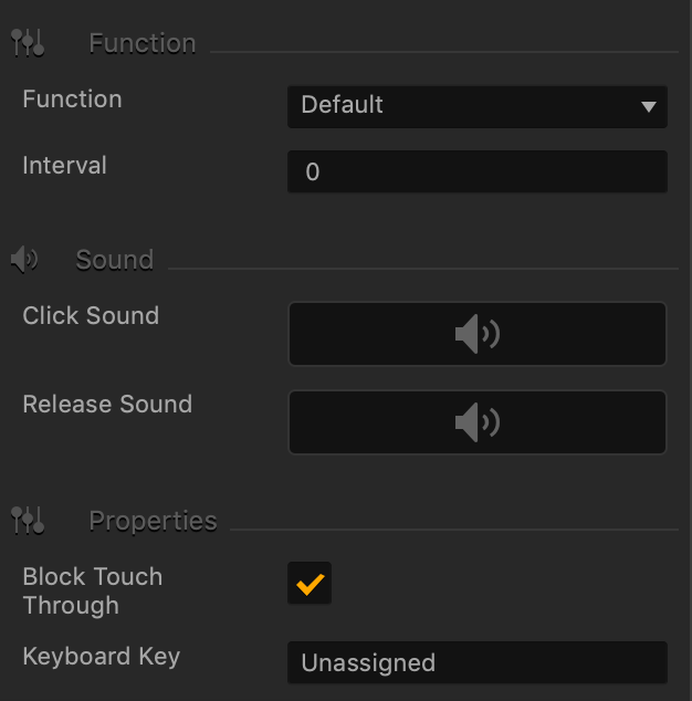
| Option | Description |
| Function | Select the appropriate function for the button:
IMPORTANT: Make sure to connect the output to the appropriate input in the Mind Map. |
| Interval | If you want the button to disappear after the player clicks it, enter the number of seconds, typically 1 or 2, after which the button should disappear. |
| Click Sound | Drag an MP3 file with the sound to be made when the player taps the button. See also Adding Music and Sound Effects. |
| Release Sound | Drag an MP3 file with the sound to be made when the player releases the button. |
| Block Touch Through | If this button happens to be stacked on top of another button, and you don’t want the player to be able to tap the button underneath and trigger its action, select this check box. |
| Keyboard Key | Typically applies to Windows exports. Type a key name that will activate the button when the user presses the specified key. In some scenarios, you may also associate it the Back button on the Android devices. |


