
Image Attributes
To add an image to a UI screen, see Adding Images. To see the attributes of an image, select it in the UI Editor or the Outliner and use the Options panel on the right.
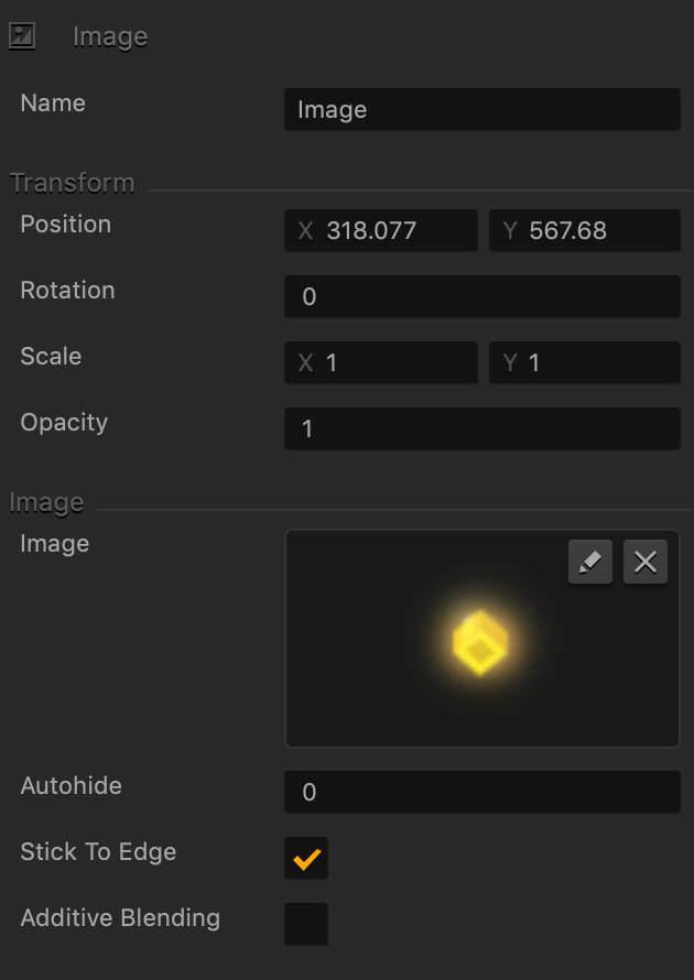
| Option | Description |
| Name | Enter a custom name for the image, if needed. It will be displayed in the Outliner.
TIP: Don’t leave this field blank, as you won’t be able to tell what object or image it is if you hide it. |
| Position | Enter the appropriate values for each axis to specify a precise position for the image on the screen.
TIP: You can also drag the image to the desired location directly in the UI Editor. |
| Rotation | Enter a degree value to specify the rotation angle of the image. |
| Scale | Enter a value for each axis to make the image as proportionally large, or wide or narrow as needed.
TIP: You can also select the image in the UI Editor and drag its corner handles to resize it as needed. |
| Opacity | Enter a value from 0 to 1 to specify the transparency of the image. For example, if you enter .5, the image will be semi-transparent. |
| Image | The preview of the image you’ve added. To replace or edit the image, click the Edit icon to display the Sprite Editor. |
| Autohide | If you want the image to appear momentarily and then fade away, specify the number of seconds for the image to be displayed for before disappearing.
To keep the button displayed on the screen, enter 0. |
| Stick to Edge | Select this checkbox to maintain button’s relative size and position when scaling the screen for different sizes. |
| Additive Blending | Select to add a glow effect overlay to any graphics or 3D objects underneath the image. |


