
When you’re designing video games, you’re making art. So, it’s important to put a little extra time and effort into your game’s overall art style and design. You don’t have to be a professional graphic designer to do this either. There are some essential mobile video game design tips that you can follow to help you design a game app that’s Top 100 worthy.
In the video below, Zack breaks down the top four mobile video game design tips that every indie developer should follow to get their games visually ready for publishers.
#1 – Choose a Great Color Palette
Color is a powerful design element. It can attract players and engage them or make them dismiss your game. So, choosing a great color palette is key. As Zack explains in the video, when you’re designing video games knowing in general what colors go best together is important. Some color combinations look good side by side while others can clash. Luckily, there are plenty of guides and useful tools out there that can help you find the perfect color combinations to use. Brightside’s Ultimate Color Combinations Cheat Sheet is an excellent reference guide. There’s a long list of various color combinations and complementary colors for a cohesive design.
We also have an excellent article that you can check out called, ‘Best Color Palette Generators for Game Design’ with over ten different free online tools you can try. A color palette generator or color scheme tool can make it easy to choose a great color palette for your game. COLOURlovers and Coolors are both excellent color palette generators to use when you need help finding the right combinations for your game design.
#2 – Avoid Using Overly Saturated Colors
The second mobile video game design tip that indie devs should follow is to avoid using overly saturated colors. Color saturation refers to the intensity or purity of the color’s shade. When a color is too saturated, it’s in a heightened form and can sometimes be jarring to the eyes in certain designs. It’s best to design a game app with muted colors. Games with muted color schemes are currently trending in the App Store. It’s vital to stay current with the latest trends when you’re trying to make the type of games that will get a publisher’s attention.
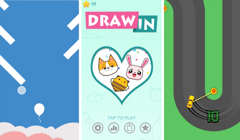
Rise Up, Draw In, and Sling Drift are all excellent examples of the use of muted colors in app design. Rise Up uses muted colors nicely and also works in a smidgen of gradient on the mountains and on the blue background. Draw In, which is also a top-ranked game is using heavily muted colors as well. If you look at the screenshot below none of the colors are too saturated. The color palette is easy on the eyes. Sling Drift also has muted tones. The road is not a pitch black shade, and the green is a nice, soft hue instead of a heavily saturated version. Aim for more muted soft colors in your game design.
#3 – Use Gradients in Your Backgrounds
The third mobile video game design tip is to use gradients, especially for your backgrounds or main menus. Gradients or color progressions is when one color slowly turns into another color. A blue shade that fades into purple or a red hue progressing into a grey. Many of the top games in the App Store rely heavily on gradients to give their game a polished feel. A hugely successful game that used this well is UsTwo’s Monument Valley. The game’s sequel, Monument Valley 2 also used stunning gradient backdrops. Ketchapp’s Stack and Voodoo Games’ Helix Jump are also great examples.
#4 – Always Add a Few Fun Effects
Another mobile video game design tip for making great looking games is always try to add a few fun effects to the mix. Don’t just stop at adding color gradients. Make your game pop by adding special effects. An easy way to do this is to take a gradient backdrop and layer some eye-catching designs over it and then turn down the opacity until it looks how you want it.
To create a fun effect in your design, you can add spikes, polygon art, bubbles, or even stars to spice up any gradient background. Select a pattern or shape that fits your game’s theme. Monument Valley, for example, used tiny stars to make a dreamy effect with their gradient backdrop. Stack did the same thing. Helix Jump used a bubble effect. The secret is to add something special to your gradients like a cool effect. When you do your games will look polished and professional.


Hi,
How can I create a gradient background like in SpeedBall in Buildbox 3?
Thanks, Viktor