
There’s one more aspect of creating games that we haven’t covered yet. Polishing your game. Virtually every successful game is polished in one way or another. In this special bonus video we’ll teach you exactly what polish is and how to properly add it to your game.
We’ll reveal some of the late stage design decisions we made with GLTCH and provide some core tips that you can use to build your own game. We’ll cover several effective strategies to use when you’re adding the final touches to your app to make it appear more polished. You’ll also learn the steps necessary to make your game publish ready.
Polishing your game is all about finding that perfect balance between minimal and simple but sleek. Throughout this bonus video from the Make Your Own Game series you’ll learn a faster way to make design decisions. Watch and follow along as we clean up the UI of GLTCH.
We’ll share some essential game design principles like elegance and tips that you can use to make your own game appear more minimal yet sleek. You’ll also learn the most important rule you need to follow in order to make your game publish ready and much more.
Polish often means toning it down. Always go too much first, then dial it back. Add too much first because that’s usually obvious, then dial it back, and you’ll eventually come across ‘just right’. This is a much faster way to make design decisions. To polish a game and make it publish worthy, we want minimal and sleek. It needs to look simple but attractive. Too simple can sometimes look unfinished, but sleek looks like you do simple on purpose and there’s a difference. You’ll see changes we made to GLTCH when we published it on the App Store.
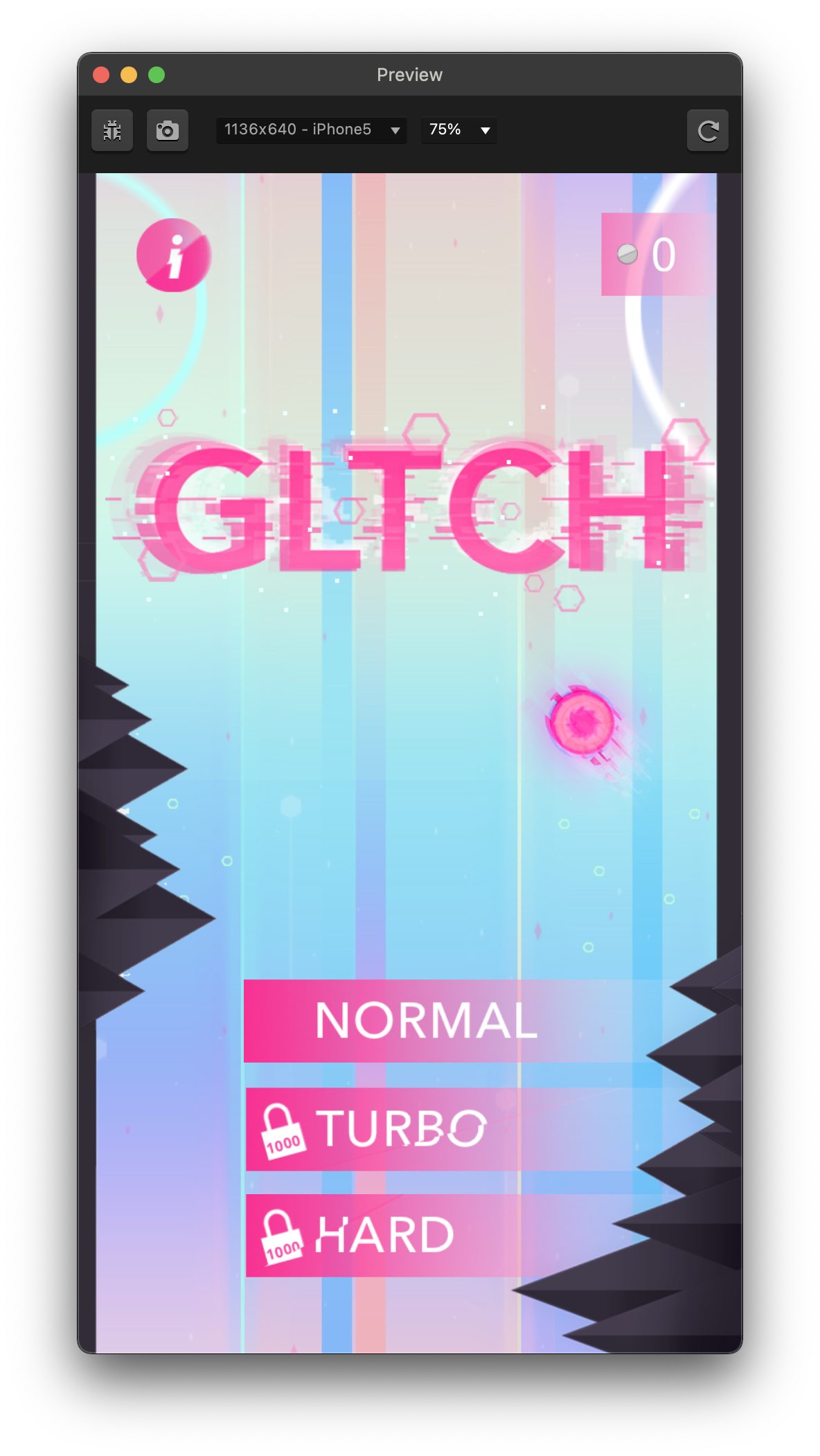
We cleaned up the UI making sure we went simple but sleek. To enhance the glitch like theme, we added glitchy animation elements to the main menu components.
We also completely bypassed the hard mode UI and turbo mode UI and take people straight to those modes from the same main menu. This is a quicker less complicated experience. It allows for only one main menu to access the entire game. A coin tracker was added to show available in-game currency for those unlock buttons.
The coin shop UI was completely removed and the character shop was moved to the game over UI.
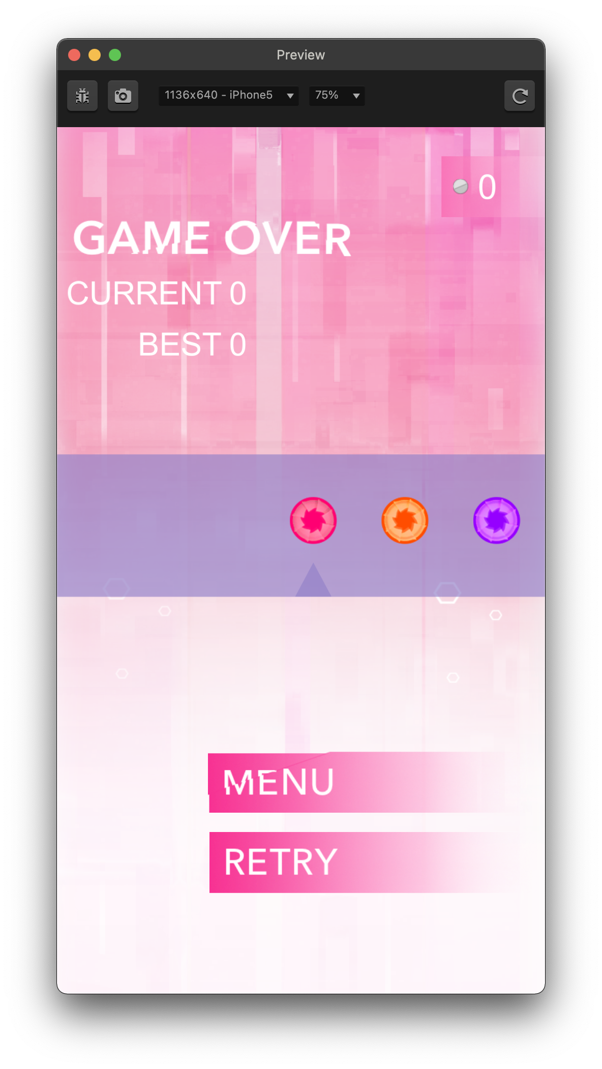
With the removal of the coin shop, it was directly incorporated into the game over UI. This brings an elegance to the game over interface.
Elegance in game design is when an element or group of elements can serve more than one purpose. We discussed similar elegant changes made to the main menu, having the mode shop be in one centralized interface.
The game over interface now serves as the character store as well. So, a coin counter was brought in to show how much in-game currency is available. Also, you can now see the distance being tracked on the game over UI as well
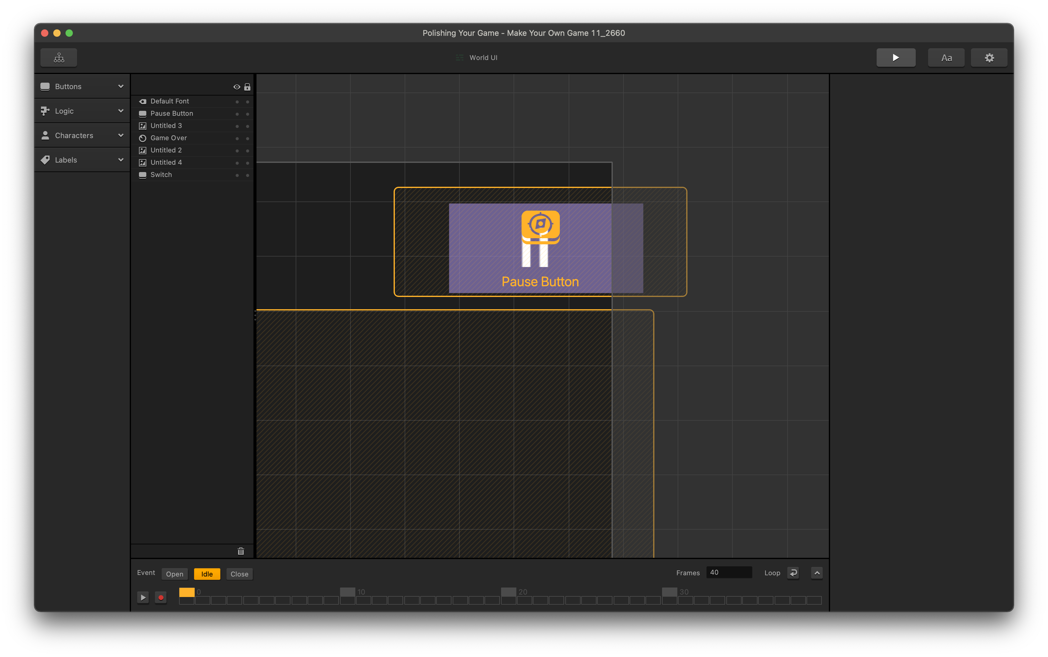
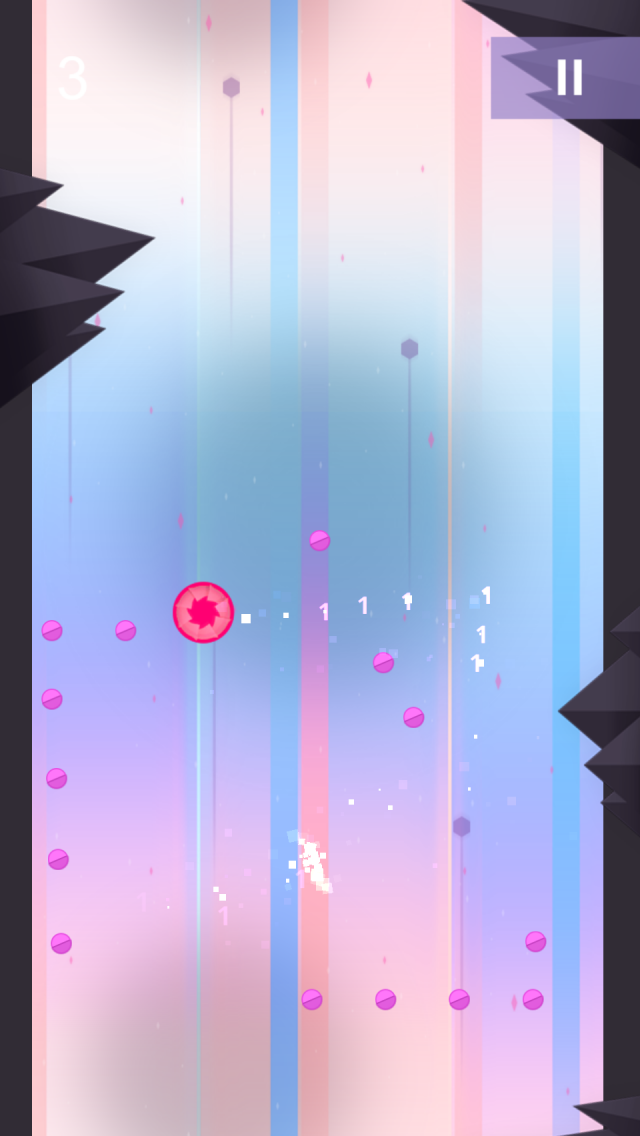
On the gameplay UI, there were also changes made to the pause button using a backdrop and a white pause button. The button seems easier to see.

Also in the UI itself, the button is simply an overlay on those images, rather than using images within a button. This makes for an easier layout and certainly easier to press for the player.
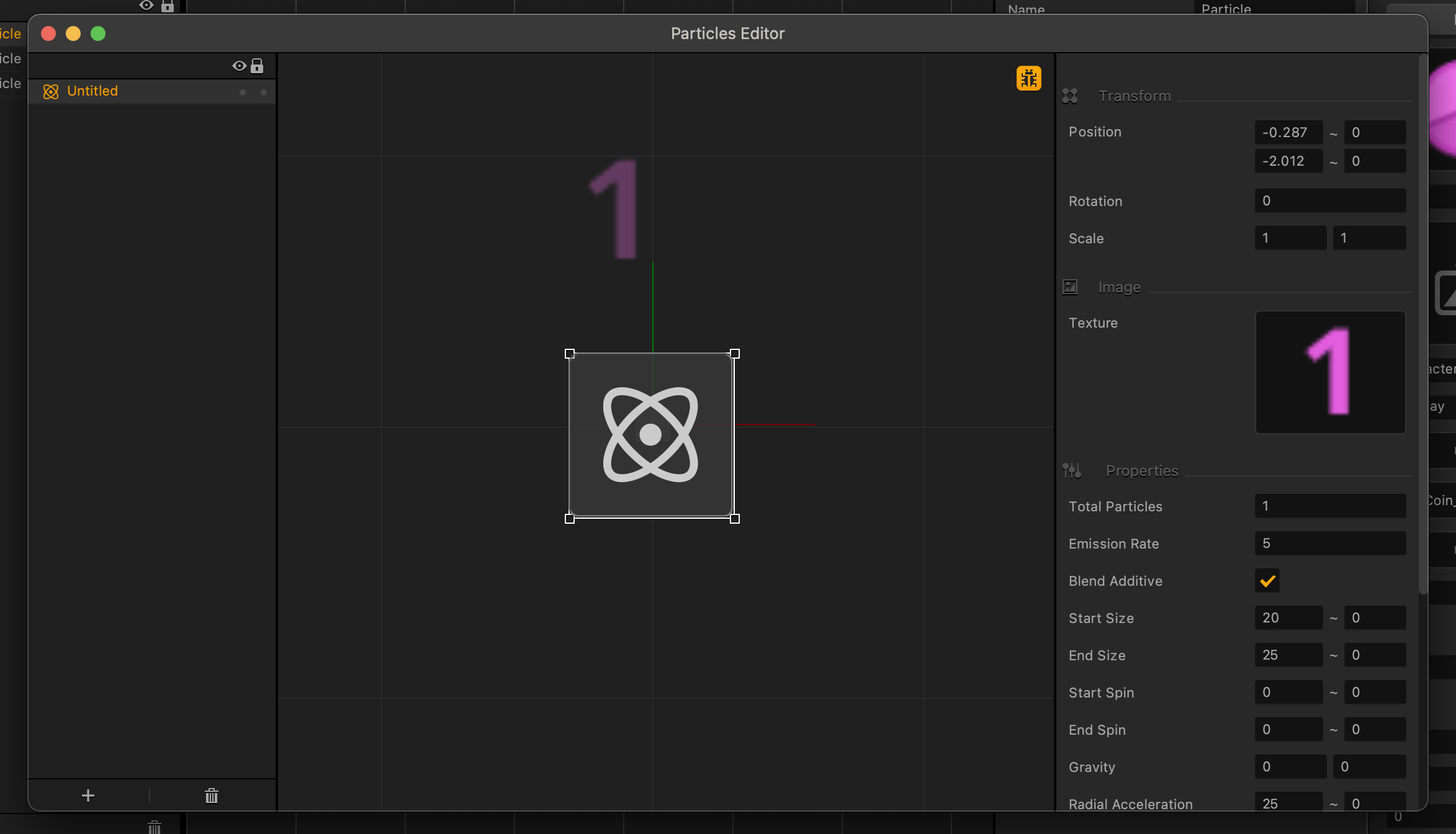
We also replaced the graphics. The first thing we did was change our coins. Realizing that our graphics utilized shadows to give dimension but were not real 3D we felt the use of a three-dimensional coin might be an aesthetic mismatch.
After further study the coins were changed to be round like the character, and not have any sharp edges like the enemies of the game.
And even though that’s a late stage design decision, it’s one that can be made easily and quickly inside of Buildbox.
We also thought that when the character picked up a coin, showing the coin amount in the traditional way didn’t quite look right at the speed this game takes place. So, the decision was made to incorporate visual feedback of the amount to be made part of the actions animation.
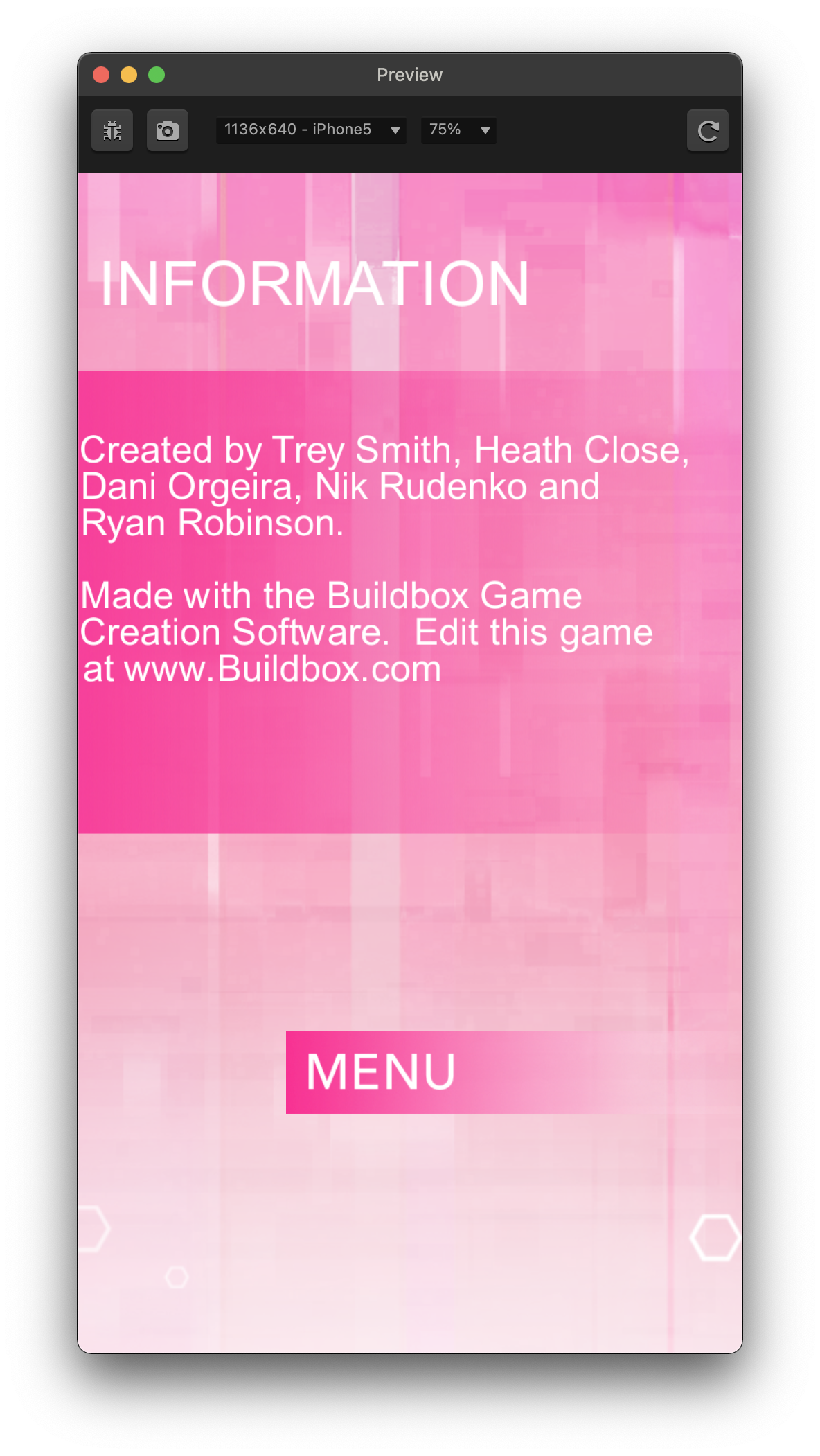
There was also an info node added to the game, with a button in the main menu, showing credits for the game.
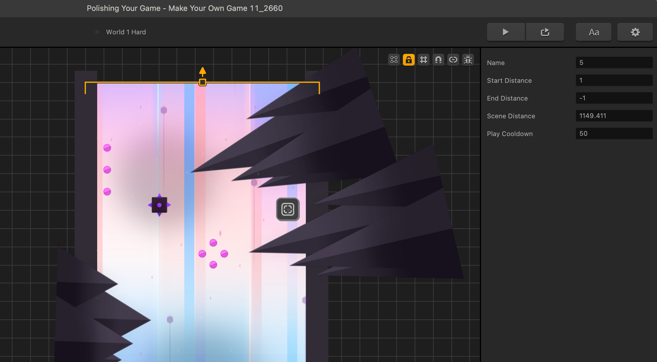
Let’s talk about the coin grab. Recent changes in the newer versions of Buildbox have presented an opportunity to show you another option when designing special entrances. The second play observer has recently been renamed – redirect and has been given some flexibility in it’s options.
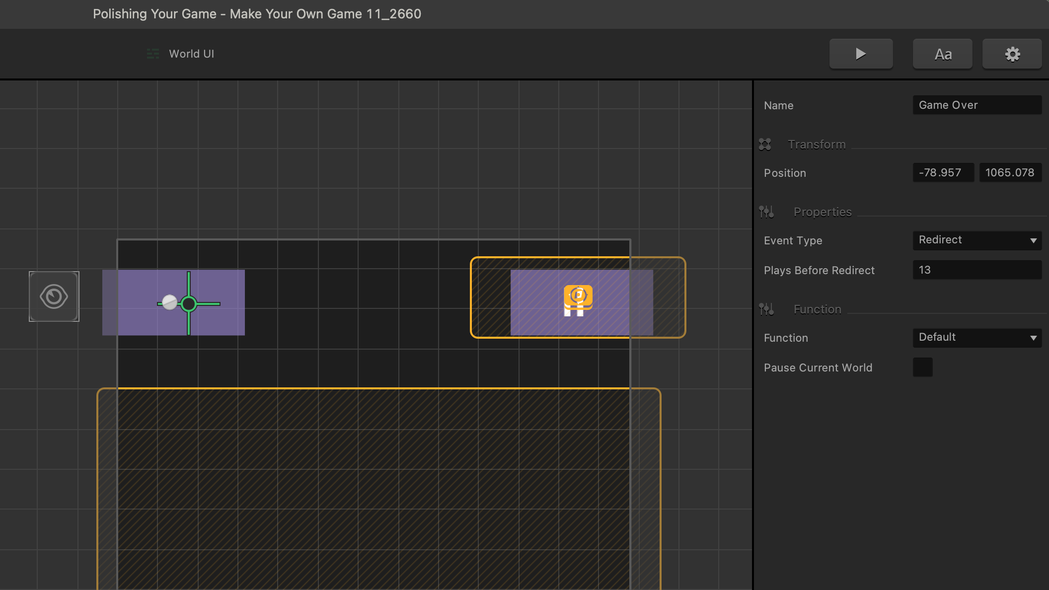
Redirect now has options to customize how many plays before the UI redirects the player. The coin grab was modified to use a menu jump instead of redirect. So, we can show you that play cooldown can also be used in creative ways. Now, the scene with the entrance to the coin grab can only be accessed after 50 player deaths once played.
Overall, the changes made bring a simple sleek elegance to the flow of the experience. The Buildbox team has a rule that a game isn’t publish ready unless it has at least 100 scenes available in a game where scenes are randomized. We have supplied you with the final version at HERE.
Feel free to fill this game out with as many scenes as you can. Building out a minimum of 100 scenes will give you two very important things:
- Important experience designing levels
- You can make this your own game
You are now ready!
Our sincere hope is that this armed you with enough information to find success making games with Buildbox.
Thank you so much!
I hope by now you have joined us in the Buildbox community forums.
Stop by the official announcements forum and say hi.. We’ll see you there!


